The Cathay Restaurant Logo
The Cathay Restaurant was one of Singapore’s leading restaurants with a colourful history going back to the heydays of the famed Cathay Hotel in which it was located. It was the place, to use a cliche, where everybody who is anybody goes to dine and wine, to see and be seen.
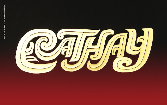
For its relaunch I was commissioned to redesign its logo and related collaterals including those for the hotel proper. I presented two logos for consideration and the one below was passed over. It was inspired by the motifs on Shang dynasty sacrificial bronzeware which I had woven into the letters.
In hindsight some of the letterforms like the H might be hard to make out unless one is already primed to see the word Cathay.
Fortunately for me the other concept (pictured in the cinema ad below) was accepted, perhaps due to its legibility and the association of Cathay with the dragon, although it is quite conventional by comparison.
For its relaunch I was commissioned to redesign its logo and related collaterals including those for the hotel proper. I presented two logos for consideration and the one below was passed over. It was inspired by the motifs on Shang dynasty sacrificial bronzeware which I had woven into the letters.
In hindsight some of the letterforms like the H might be hard to make out unless one is already primed to see the word Cathay.
 |
| Letterforms inspired by the curlicue motifs on Shang dynasty sacrificial bronzeware like the water instrument on display in the Shanghai Museum, below. |
Fortunately for me the other concept (pictured in the cinema ad below) was accepted, perhaps due to its legibility and the association of Cathay with the dragon, although it is quite conventional by comparison.
 |
| The approved logo featured in a cinema ad. |


Comments
Post a Comment