Posts

Featured Post

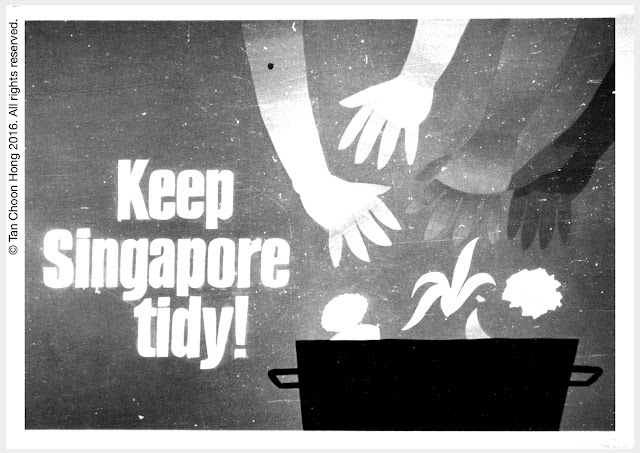
Inspired by the Salon des Refusés, Paris 1863

When numerous artists whose works for exhibition at the annual Salon Paris were turned down by the jury, they found an unexpected champion, none other than Emperor Napoleon III. Responding to public concern over the decisions of the jurors, Napoleon set up the Salon des Refusés in 1863 to let the rejected works gain some public exposure, deservedly or not. Read more here. In my career I have faced many such "refusés" situations, but instead of letting them get me down, I just filed away the works. Some eventually metamorphosised into new works, others are still languishing in my portfolios. In this blog I will resurrect some of the stuff that my clients rejected and post them for public review. Roses or rotten tomatoes, I'll take them in my stride. Preparation works including scanning of pre-digital pieces are ongoing for new posts.

The hidden power in your zodiac sign

Image
Your zodiac sign holds the key to hidden potential and sources of power. So kickstart your day with a dose of Zodiac Power! Feed your inner Greek god or goddess that rules over your zodiac sign and feel a surge of electrifying energy to prep you for any challenge ahead. What can Aries do for me? Aries is ruled by Ares, Greek God of War. Unleash your inner warrior and let his fearless spirit, motivate you to face life's battles with unwavering courage. Like Ares, charge into the fray of adversity with confidence and determination. Embrace the essence of Ares, and let it fuel your inner strength, ensuring victory in every challenge. This inspiring 30 x 20" poster features Ares, God of War in full warrior regalia. Constant reminder of your zodiac power Tap into the power of your zodiac sign with this stunning poster, a constant companion in your favourite space at home or in your office.  See all 12 zodiac power posters at zazzle.com/virtuocity.  

Riding the AI Revolution to Achieve Top-of-Mind Awareness

Image
  Artificial Intelligence as a tool With Artificial Intelligence sweeping the world by storm, our product positioning for Pilot Pen as the leader in pen technology and innovation has found the perfect vehicle to drive up top-of-mind awareness. We proposed kicking off a promo in school bookshops featuring, you guessed it, AI generated content containing gleaming metallic robots against galactic night-sky backgrounds evoking a futuristic world for Pilot Pen products. We would do three ads centred on this theme.  Launch ad featured AI-generated robot hand and galactic sky The launch ad offering two free tubes of pencil lead refills with pen purchase performed to expectations and generated considerable buzz in the schools. This AI generated image featured a chrome-finished steel robot's hand  against a galactic sky background. Followup ad didn’t go down well. For the next ad in the series which offered a free ink refill with pen purchase, we continued focusing on the produc

Riveting Adventure Romance filled with love, intrigue, betrayal.

Image
  Nanyang  a graphic novel by  Tan Choon Hong  is now an eBook  and Paperback  on Amazon.com and Apple Books Over 100 pages of adventure romance. Love! Intrigue! Betrayal! Preview the contents here Watch the Preview Video below: An epic journey that spans the region the Chinese call Nanyang. Two brothers, hearing tales of a city where the streets are paved in gold, head south seeking a piece of the action. After a traumatic separation and several harrowing experiences, the brothers finally meet on opposite sides of the law.  Will they recognise each other as family or will loyalty to their masters triumph to turn them into deadly enemies? Book link on  Amazon.com:  

Stone Age tribe found in Singapore.

Image
While working on some export promotional packaging for spice paste maker Asian Home Gourmet at the turn of the millennium, I was invited to pitch for a print advertising campaign. These products take the chore out of cooking traditional local specialties like curries, stews, roasts and stir-fries which involve gathering many ingredients that are then pounded or ground in stone pestle and mortar implements. The arrival of electric food processors do help, but AHG’s spice pastes take it one step further by providing all the key ingredients in a ready-to-use sachet. The old way is so yesterday and literally so Stone Age using those granite grinding devices. Hence the theme adopted here to bring out the wow factor of convenience in a bag. The first concept (above)  was to be rendered in comics style, telling of a family rescued from stone age drudgery. I toyed with another headline "Stone Age tribe found in Singapore" but decided prudence was the better part of valo

The Incredible Shrinking Poster

Image
In the so called pioneer days of post independence Singapore, and at the start of that incredible journey that “turned a backwater swampland into a thriving metropolis”, as the ruling party’s propaganda machine likes to remind us, we the citizens played our part in “nation building” by participating in endless campaigns to that end.  Yours truly was summoned by the clarion call to Keep Singapore Clean by contributing a poster in the nationwide contest. I submitted four designs as follows:  Four arms of different skin tones representing the four main races of the population. The Lion of Singapura (Lion City) doing his bit for "nation building." Who would refuse the flag waving Lion's appeal to duty? Nothing like pulling the heart strings. Although all were rejected for the top prize, one did receive a Highly Commended Award which, for unknown and unremembered reasons, I did not show up to collect even though the presentation and exhibition venue

A life-changing rejection

Image
Upon finishing school I hit the pavement in search of my first job. My heart was set on becoming an advertising artist.  In those days, there were no graphic design colleges here, and artists basically learned the ropes through apprenticeship. I had a good idea of what my job would be like, having seen advertising people portrayed in the movies. It would be packed with excitement, glamour, fast cars, fast women, high octane living. As there were no Yellow Pages then, I ploughed through the telephone directory looking for companies with the word advertising in their names. I wrote to a dozen of them and several replied with the usual regrets, and three offered to interview. For my first interview I went to Papineau Advertising and my rudimentary portfolio was reviewed by art director Bill Mundy. I saw for the first time the actual illustrations used in their Milo press ads. They were photoprints of sportsmen rendered in pure black and white, then retouched by hand using pen and i

The Cathay Restaurant Logo

Image
The Cathay Restaurant was one of Singapore’s leading restaurants with a colourful history going back to the heydays of the famed Cathay Hotel in which it was located. It was the place, to use a cliche, where everybody who is anybody goes to dine and wine, to see and be seen. For its relaunch I was commissioned to redesign its logo and related collaterals including those for the hotel proper. I presented two logos for consideration and the one below was passed over. It was inspired by the motifs on Shang dynasty sacrificial bronzeware which I had woven into the letters.  In hindsight some of the letterforms like the H might be hard to make out unless one is already primed to see the word Cathay.   Letterforms inspired by the curlicue motifs on Shang dynasty sacrificial bronzeware like the water instrument on display in the Shanghai Museum, below.   Fortunately for me the other concept (pictured in the cinema ad below) was accepted, perhaps due to its legibility and the

The Romance of Travel lives on

Image
In the early days of serving on the Brand’s Essence of Chicken account I was assigned a project to produce a three-bottle traveller’s pack to be retailed at the airport duty-free shop. I proposed several directions for the client to consider, and the concept selected was the one revolving round the romance of travel. After further development, the retailer side suddenly decided to abandon the project. Exploratory sketches of selected design direction based on the romance of travel. More detailed explanation Alternative graphic treatment.  Using clipart to provide a clearer indication of the finished result. The romance of travel sat on the back burner lying dormant for several years till a call from another client requesting a tourist pack to be designed. The idea that was in gestation became the inspiration for the new job. The theme reborn as a set of 5 individually packed pens with its own pen-holder for desktop use (draft concept)

Millennium 2000 Celebrations Logo

Image
The design below is one of two submissions for the Millennium 2000 logo design competition held in conjunction with the Singapore Millennium 2000 celebrations. Yes, the dread Y2K bug was lurking on the horizon and scheduled to wreak havoc on 1.1.00 but the island nation was also preparing to party through it all. When I went to collect the rejected artwork, a lady staffer told me it had been shortlisted for the final selection. The logo did not die and was resurrected as a Singapore T-shirt and assorted tourist souvenirs on my online store zazzle.com/virtuocity . It is also widely pirated by other T-shirt vendors, and wholesale copies and variations can be spotted in tourist haunts especially on Temple Street, Chinatown.

Designs for 'Easy2Eat' food service in Shanghai

Image
The client is a startup catering company venturing into cooked food to be sold over the counter at food stations and in restaurants. The design brief calls for I. The development of a logo to be followed by a full corp orate ID programme. II. The design of a food station in a leading mall as a test launch. BRANDING We proposed the following concept for the logo: 1.  A mascot or character of a happy mouth with two thumbs up. 2.  Orange and red identifying colours to suggest appetizing food and friendly service. 3.  Bilingual naming in accordance with the market norm with English given prominence. The client liked the concept but asked for alternatives to be submitted. We felt the essence of the design is simply the face and thumb, so proceeded with refinements, keeping the legs in one character for comparison. A heavy font the client specifically requested was incorporated.  The client had a change of heart and thought we should pursue a more “